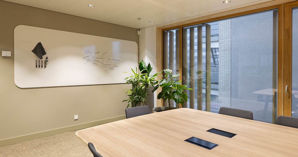
Pick a whiteboard colour that looks close to a brand palette on screen, and it can read as an obvious mismatch once it is a metre wide on a real wall under real lighting. Scale and lighting change how a colour reads, which is why matching a design whiteboard to a brand palette needs more than a swatch comparison. Check it properly and the panel reads as part of the brand, not an approximation of it. This matters most for organisations planning to install more than one board across different rooms or offices, where an inconsistent match between locations is more noticeable than a single board that is slightly off on its own.

Array
(
    [1049] => WP_Post Object
        (
            [ID] => 1049
            [post_author] => 1
            [post_date] => 2026-10-20 06:45:09
            [post_date_gmt] => 2019-08-05 13:54:24
            [post_content] =>
            [post_title] => Products
            [post_excerpt] =>
            [post_status] => publish
            [comment_status] => closed
            [ping_status] => closed
            [post_password] =>
            [post_name] => whiteboards-5
            [to_ping] =>
            [pinged] =>
            [post_modified] => 2026-10-20 06:45:09
            [post_modified_gmt] => 2026-10-20 06:45:09
            [post_content_filtered] =>
            [post_parent] => 0
            [guid] => https://chameleonwriting.falkor.alcor.cloud/?p=1049
            [menu_order] => 1
            [post_type] => nav_menu_item
            [post_mime_type] =>
            [comment_count] => 0
            [filter] => raw
            [db_id] => 1049
            [menu_item_parent] => 0
            [object_id] => 1049
            [object] => custom
            [type] => custom
            [type_label] => Custom Link
            [title] => Products
            [url] => #
            [target] =>
            [attr_title] =>
            [description] =>
            [classes] => Array
                (
                    [0] =>
                )

            [xfn] =>
        )

    [12842] => WP_Post Object
        (
            [ID] => 12842
            [post_author] => 82
            [post_date] => 2026-10-20 06:45:10
            [post_date_gmt] => 2023-08-31 08:07:16
            [post_content] =>
            [post_title] =>
            [post_excerpt] =>
            [post_status] => publish
            [comment_status] => closed
            [ping_status] => closed
            [post_password] =>
            [post_name] => 12842
            [to_ping] =>
            [pinged] =>
            [post_modified] => 2026-10-20 06:45:10
            [post_modified_gmt] => 2026-10-20 06:45:10
            [post_content_filtered] =>
            [post_parent] => 0
            [guid] => https://chameleonwriting.falkor.alcor.cloud/?p=12842
            [menu_order] => 68
            [post_type] => nav_menu_item
            [post_mime_type] =>
            [comment_count] => 0
            [filter] => raw
            [db_id] => 12842
            [menu_item_parent] => 0
            [object_id] => 12839
            [object] => page
            [type] => post_type
            [type_label] => Page
            [url] => https://chameleonwriting.com/en/references-3/
            [title] => References
            [target] =>
            [attr_title] =>
            [description] =>
            [classes] => Array
                (
                    [0] =>
                )

            [xfn] =>
        )

    [11862] => WP_Post Object
        (
            [ID] => 11862
            [post_author] => 82
            [post_date] => 2026-10-20 06:45:10
            [post_date_gmt] => 2023-08-21 13:36:51
            [post_content] =>
            [post_title] => pCon
            [post_excerpt] =>
            [post_status] => publish
            [comment_status] => closed
            [ping_status] => closed
            [post_password] =>
            [post_name] => pcon-data
            [to_ping] =>
            [pinged] =>
            [post_modified] => 2026-10-20 06:45:10
            [post_modified_gmt] => 2026-10-20 06:45:10
            [post_content_filtered] =>
            [post_parent] => 642
            [guid] => https://chameleonwriting.falkor.alcor.cloud/?p=11862
            [menu_order] => 69
            [post_type] => nav_menu_item
            [post_mime_type] =>
            [comment_count] => 0
            [filter] => raw
            [db_id] => 11862
            [menu_item_parent] => 0
            [object_id] => 4701
            [object] => page
            [type] => post_type
            [type_label] => Page
            [url] => https://chameleonwriting.com/en/information/chameleon-now-available-in-pcon/
            [title] => pCon
            [target] =>
            [attr_title] =>
            [description] =>
            [classes] => Array
                (
                    [0] =>
                )

            [xfn] =>
        )

    [32752] => WP_Post Object
        (
            [ID] => 32752
            [post_author] => 85
            [post_date] => 2026-10-20 06:45:10
            [post_date_gmt] => 2025-08-07 10:59:20
            [post_content] =>
            [post_title] => Order Samples
            [post_excerpt] =>
            [post_status] => publish
            [comment_status] => closed
            [ping_status] => closed
            [post_password] =>
            [post_name] => order-samples-2
            [to_ping] =>
            [pinged] =>
            [post_modified] => 2026-10-20 06:45:10
            [post_modified_gmt] => 2026-10-20 06:45:10
            [post_content_filtered] =>
            [post_parent] => 0
            [guid] => https://chameleonwriting.com/?p=32752
            [menu_order] => 70
            [post_type] => nav_menu_item
            [post_mime_type] =>
            [comment_count] => 0
            [filter] => raw
            [db_id] => 32752
            [menu_item_parent] => 0
            [object_id] => 32718
            [object] => page
            [type] => post_type
            [type_label] => Page
            [url] => https://chameleonwriting.com/en/chameleon-samples/
            [title] => Order Samples
            [target] =>
            [attr_title] =>
            [description] =>
            [classes] => Array
                (
                    [0] =>
                )

            [xfn] =>
        )

    [26482] => WP_Post Object
        (
            [ID] => 26482
            [post_author] => 85
            [post_date] => 2026-10-20 06:45:10
            [post_date_gmt] => 2025-01-17 11:08:57
            [post_content] =>
            [post_title] => Information
            [post_excerpt] =>
            [post_status] => publish
            [comment_status] => closed
            [ping_status] => closed
            [post_password] =>
            [post_name] => information-2
            [to_ping] =>
            [pinged] =>
            [post_modified] => 2026-10-20 06:45:10
            [post_modified_gmt] => 2026-10-20 06:45:10
            [post_content_filtered] =>
            [post_parent] => 0
            [guid] => https://chameleonwriting.com/?p=26482
            [menu_order] => 71
            [post_type] => nav_menu_item
            [post_mime_type] =>
            [comment_count] => 0
            [filter] => raw
            [db_id] => 26482
            [menu_item_parent] => 0
            [object_id] => 26482
            [object] => custom
            [type] => custom
            [type_label] => Custom Link
            [title] => Information
            [url] => #
            [target] =>
            [attr_title] =>
            [description] =>
            [classes] => Array
                (
                    [0] =>
                )

            [xfn] =>
        )

    [36031] => WP_Post Object
        (
            [ID] => 36031
            [post_author] => 85
            [post_date] => 2026-10-20 06:45:10
            [post_date_gmt] => 2025-11-12 11:54:33
            [post_content] =>
            [post_title] => ProTips
            [post_excerpt] =>
            [post_status] => publish
            [comment_status] => closed
            [ping_status] => closed
            [post_password] =>
            [post_name] => protips-2
            [to_ping] =>
            [pinged] =>
            [post_modified] => 2026-10-20 06:45:10
            [post_modified_gmt] => 2026-10-20 06:45:10
            [post_content_filtered] =>
            [post_parent] => 0
            [guid] => https://chameleonwriting.com/?p=36031
            [menu_order] => 78
            [post_type] => nav_menu_item
            [post_mime_type] =>
            [comment_count] => 0
            [filter] => raw
            [db_id] => 36031
            [menu_item_parent] => 0
            [object_id] => -325
            [object] => kennisbank
            [type] => post_type_archive
            [title] => ProTips
            [type_label] => Post Type Archive
            [url] => https://chameleonwriting.com/en/protips/
            [target] =>
            [attr_title] =>
            [description] =>
            [classes] => Array
                (
                    [0] =>
                )

            [xfn] =>
        )

    [19332] => WP_Post Object
        (
            [ID] => 19332
            [post_author] => 3
            [post_date] => 2026-10-20 06:45:10
            [post_date_gmt] => 2024-05-14 11:58:44
            [post_content] =>
            [post_title] => Contact
            [post_excerpt] =>
            [post_status] => publish
            [comment_status] => closed
            [ping_status] => closed
            [post_password] =>
            [post_name] => contact-4
            [to_ping] =>
            [pinged] =>
            [post_modified] => 2026-10-20 06:45:10
            [post_modified_gmt] => 2026-10-20 06:45:10
            [post_content_filtered] =>
            [post_parent] => 0
            [guid] => https://chameleonwriting.com/?p=19332
            [menu_order] => 79
            [post_type] => nav_menu_item
            [post_mime_type] =>
            [comment_count] => 0
            [filter] => raw
            [db_id] => 19332
            [menu_item_parent] => 0
            [object_id] => 19332
            [object] => custom
            [type] => custom
            [type_label] => Custom Link
            [title] => Contact
            [url] => https://chameleonwriting.com/en/contact/
            [target] =>
            [attr_title] =>
            [description] =>
            [classes] => Array
                (
                    [0] =>
                )

            [xfn] =>
        )

    [12326] => WP_Post Object
        (
            [ID] => 12326
            [post_author] => 82
            [post_date] => 2026-10-20 06:45:10
            [post_date_gmt] => 2023-08-25 07:08:58
            [post_content] =>
            [post_title] => Languages
            [post_excerpt] =>
            [post_status] => publish
            [comment_status] => closed
            [ping_status] => closed
            [post_password] =>
            [post_name] => taalschakelaar-6
            [to_ping] =>
            [pinged] =>
            [post_modified] => 2026-10-20 06:45:10
            [post_modified_gmt] => 2026-10-20 06:45:10
            [post_content_filtered] =>
            [post_parent] => 0
            [guid] => https://chameleonwriting.falkor.alcor.cloud/?p=12326
            [menu_order] => 80
            [post_type] => nav_menu_item
            [post_mime_type] =>
            [comment_count] => 0
            [filter] => raw
            [db_id] => 12326
            [menu_item_parent] => 0
            [object_id] => 12326
            [object] => custom
            [type] => custom
            [type_label] => Language switcher
            [title] => EN
            [url] => #pll_switcher
            [target] =>
            [attr_title] =>
            [description] =>
            [classes] => Array
                (
                    [0] => pll-parent-menu-item
                )

            [xfn] =>
        )

)
1
News
Matching a design whiteboard finish to an existing brand colour palette
Why a close shade is not always a good match
Brand colours are usually chosen for logos and print materials, which behave differently to a large painted or coated surface under office lighting. A whiteboard finish that looks correct as a small swatch can read quite differently once applied across a much larger area at eye level. This is particularly true for coated or laminated finishes, which can shift a colour’s apparent warmth or brightness compared with the same shade on paper or fabric. A quick way to sense-check this before ordering a sample is to look at how the same brand colour is used on any existing large signage or vehicle livery, since those applications face the same scale problem.
How scale changes the way a colour reads
A colour that feels balanced in a small logo can feel overwhelming or muted once scaled up to cover a whole wall-mounted board, since large areas of colour behave differently to small accents. This is one of the most common surprises when a brand colour is applied directly to a whiteboard finish without adjustment. Testing a sample at full board size, rather than judging from a swatch, is the only reliable way to catch this before installation. Board suppliers with an in-house colour-matching service can usually produce a large-format sample panel rather than a small swatch, which makes this scale effect much easier to judge before the final finish is locked in.
Working with secondary brand tones instead
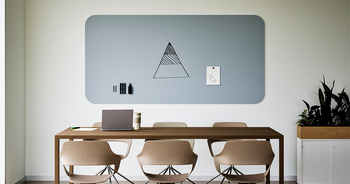
Rather than using a primary brand colour at full strength, many interiors get a better result from a secondary or muted tone drawn from the same palette, applied to the frame or surround rather than the full writing surface. This keeps the brand connection recognisable without overwhelming the room or the board’s legibility. It also tends to age better, since a bold primary colour can start to feel dated well before a muted, neutral-leaning tone does. A secondary tone applied to just the frame, rather than the whole board, also gives a lighter branding touch that some interiors prefer over a fully coloured writing surface.
Keeping the writing surface functional
Whatever finish is chosen, the core writing surface needs to remain genuinely usable, since a heavily tinted board can reduce marker visibility if the colour and marker choice are not tested together. Testing marker colours against the proposed finish before committing avoids ending up with a branded board that is harder to read from than it should be. Dry-erase markers in black and dark blue generally show up more reliably across tinted finishes than lighter marker colours, which is worth checking during the same sample review.
A practical approach to getting the match right
Requesting a physical sample of the proposed finish, viewed against actual brand material under the room’s intended lighting, is the most reliable way to confirm a colour match before committing to a full board. This avoids costly mismatches that only become obvious once the board is installed. It is worth requesting the sample early enough in the project timeline to allow for a second round if the first attempt is not close enough, rather than treating the first sample as final by default.
Reviewing a sample under more than one lighting condition
A brand colour applied to a design whiteboard can look noticeably different under a bright overhead office light than it does under softer, warmer lighting closer to a window, which is why reviewing a physical sample at more than one point during the day gives a far more reliable impression than a single quick check in a showroom. Rooms with large windows are worth checking specifically, since natural light shifts the apparent tone of a finish far more across a day than most artificial office lighting does.
What to do if the exact colour cannot be matched precisely
Sometimes a brand colour simply cannot be reproduced exactly on the specific finish material available for a design whiteboard, in which case choosing the closest achievable match and testing it directly against real brand material, rather than a printed swatch, is the most practical way forward. A slight, deliberate variation is usually less noticeable in person than it appears when comparing colour codes side by side on a screen. Documenting the agreed variation, including the specific finish code and the lighting conditions it was approved under, also makes it easier to specify the same finish consistently if further boards are added to other rooms later.
When a secondary tone is the safer choice from the start
For a company still finalising its full brand guidelines, or one with a primary colour that is genuinely difficult to reproduce well on a large surface, starting directly with a secondary or muted tone rather than attempting the primary colour first often produces a better result with less back and forth. This approach also reduces the risk of the finished board looking noticeably different from how it appeared during the approval process, since secondary tones tend to be more forgiving of small production or lighting variations than a precisely specified primary colour.
Looking for a design whiteboard?
Learn how design whiteboard can be specified for your project.
Need immediate help and advice with your choice?