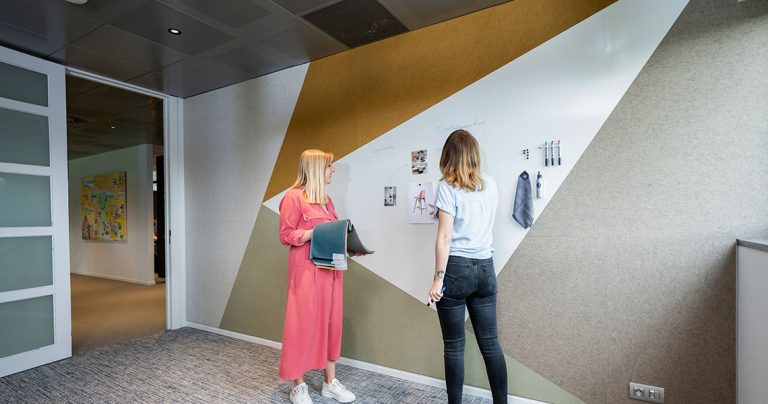
Cut a large logo or skyline silhouette into a custom whiteboard without planning for how much writing area it removes, and a board that looks striking on day one can end up frustratingly short on usable space day to day. Branding a board without compromising the writing surface means choosing where and how much material the branding takes up, not just what it depicts. Get that right and the board brands the space without giving up its performance as a writing surface.

Array
(
    [1049] => WP_Post Object
        (
            [ID] => 1049
            [post_author] => 1
            [post_date] => 2026-10-20 06:45:09
            [post_date_gmt] => 2019-08-05 13:54:24
            [post_content] =>
            [post_title] => Products
            [post_excerpt] =>
            [post_status] => publish
            [comment_status] => closed
            [ping_status] => closed
            [post_password] =>
            [post_name] => whiteboards-5
            [to_ping] =>
            [pinged] =>
            [post_modified] => 2026-10-20 06:45:09
            [post_modified_gmt] => 2026-10-20 06:45:09
            [post_content_filtered] =>
            [post_parent] => 0
            [guid] => https://chameleonwriting.falkor.alcor.cloud/?p=1049
            [menu_order] => 1
            [post_type] => nav_menu_item
            [post_mime_type] =>
            [comment_count] => 0
            [filter] => raw
            [db_id] => 1049
            [menu_item_parent] => 0
            [object_id] => 1049
            [object] => custom
            [type] => custom
            [type_label] => Custom Link
            [title] => Products
            [url] => #
            [target] =>
            [attr_title] =>
            [description] =>
            [classes] => Array
                (
                    [0] =>
                )

            [xfn] =>
        )

    [12842] => WP_Post Object
        (
            [ID] => 12842
            [post_author] => 82
            [post_date] => 2026-10-20 06:45:10
            [post_date_gmt] => 2023-08-31 08:07:16
            [post_content] =>
            [post_title] =>
            [post_excerpt] =>
            [post_status] => publish
            [comment_status] => closed
            [ping_status] => closed
            [post_password] =>
            [post_name] => 12842
            [to_ping] =>
            [pinged] =>
            [post_modified] => 2026-10-20 06:45:10
            [post_modified_gmt] => 2026-10-20 06:45:10
            [post_content_filtered] =>
            [post_parent] => 0
            [guid] => https://chameleonwriting.falkor.alcor.cloud/?p=12842
            [menu_order] => 68
            [post_type] => nav_menu_item
            [post_mime_type] =>
            [comment_count] => 0
            [filter] => raw
            [db_id] => 12842
            [menu_item_parent] => 0
            [object_id] => 12839
            [object] => page
            [type] => post_type
            [type_label] => Page
            [url] => https://chameleonwriting.com/en/references-3/
            [title] => References
            [target] =>
            [attr_title] =>
            [description] =>
            [classes] => Array
                (
                    [0] =>
                )

            [xfn] =>
        )

    [11862] => WP_Post Object
        (
            [ID] => 11862
            [post_author] => 82
            [post_date] => 2026-10-20 06:45:10
            [post_date_gmt] => 2023-08-21 13:36:51
            [post_content] =>
            [post_title] => pCon
            [post_excerpt] =>
            [post_status] => publish
            [comment_status] => closed
            [ping_status] => closed
            [post_password] =>
            [post_name] => pcon-data
            [to_ping] =>
            [pinged] =>
            [post_modified] => 2026-10-20 06:45:10
            [post_modified_gmt] => 2026-10-20 06:45:10
            [post_content_filtered] =>
            [post_parent] => 642
            [guid] => https://chameleonwriting.falkor.alcor.cloud/?p=11862
            [menu_order] => 69
            [post_type] => nav_menu_item
            [post_mime_type] =>
            [comment_count] => 0
            [filter] => raw
            [db_id] => 11862
            [menu_item_parent] => 0
            [object_id] => 4701
            [object] => page
            [type] => post_type
            [type_label] => Page
            [url] => https://chameleonwriting.com/en/information/chameleon-now-available-in-pcon/
            [title] => pCon
            [target] =>
            [attr_title] =>
            [description] =>
            [classes] => Array
                (
                    [0] =>
                )

            [xfn] =>
        )

    [32752] => WP_Post Object
        (
            [ID] => 32752
            [post_author] => 85
            [post_date] => 2026-10-20 06:45:10
            [post_date_gmt] => 2025-08-07 10:59:20
            [post_content] =>
            [post_title] => Order Samples
            [post_excerpt] =>
            [post_status] => publish
            [comment_status] => closed
            [ping_status] => closed
            [post_password] =>
            [post_name] => order-samples-2
            [to_ping] =>
            [pinged] =>
            [post_modified] => 2026-10-20 06:45:10
            [post_modified_gmt] => 2026-10-20 06:45:10
            [post_content_filtered] =>
            [post_parent] => 0
            [guid] => https://chameleonwriting.com/?p=32752
            [menu_order] => 70
            [post_type] => nav_menu_item
            [post_mime_type] =>
            [comment_count] => 0
            [filter] => raw
            [db_id] => 32752
            [menu_item_parent] => 0
            [object_id] => 32718
            [object] => page
            [type] => post_type
            [type_label] => Page
            [url] => https://chameleonwriting.com/en/chameleon-samples/
            [title] => Order Samples
            [target] =>
            [attr_title] =>
            [description] =>
            [classes] => Array
                (
                    [0] =>
                )

            [xfn] =>
        )

    [26482] => WP_Post Object
        (
            [ID] => 26482
            [post_author] => 85
            [post_date] => 2026-10-20 06:45:10
            [post_date_gmt] => 2025-01-17 11:08:57
            [post_content] =>
            [post_title] => Information
            [post_excerpt] =>
            [post_status] => publish
            [comment_status] => closed
            [ping_status] => closed
            [post_password] =>
            [post_name] => information-2
            [to_ping] =>
            [pinged] =>
            [post_modified] => 2026-10-20 06:45:10
            [post_modified_gmt] => 2026-10-20 06:45:10
            [post_content_filtered] =>
            [post_parent] => 0
            [guid] => https://chameleonwriting.com/?p=26482
            [menu_order] => 71
            [post_type] => nav_menu_item
            [post_mime_type] =>
            [comment_count] => 0
            [filter] => raw
            [db_id] => 26482
            [menu_item_parent] => 0
            [object_id] => 26482
            [object] => custom
            [type] => custom
            [type_label] => Custom Link
            [title] => Information
            [url] => #
            [target] =>
            [attr_title] =>
            [description] =>
            [classes] => Array
                (
                    [0] =>
                )

            [xfn] =>
        )

    [36031] => WP_Post Object
        (
            [ID] => 36031
            [post_author] => 85
            [post_date] => 2026-10-20 06:45:10
            [post_date_gmt] => 2025-11-12 11:54:33
            [post_content] =>
            [post_title] => ProTips
            [post_excerpt] =>
            [post_status] => publish
            [comment_status] => closed
            [ping_status] => closed
            [post_password] =>
            [post_name] => protips-2
            [to_ping] =>
            [pinged] =>
            [post_modified] => 2026-10-20 06:45:10
            [post_modified_gmt] => 2026-10-20 06:45:10
            [post_content_filtered] =>
            [post_parent] => 0
            [guid] => https://chameleonwriting.com/?p=36031
            [menu_order] => 78
            [post_type] => nav_menu_item
            [post_mime_type] =>
            [comment_count] => 0
            [filter] => raw
            [db_id] => 36031
            [menu_item_parent] => 0
            [object_id] => -325
            [object] => kennisbank
            [type] => post_type_archive
            [title] => ProTips
            [type_label] => Post Type Archive
            [url] => https://chameleonwriting.com/en/protips/
            [target] =>
            [attr_title] =>
            [description] =>
            [classes] => Array
                (
                    [0] =>
                )

            [xfn] =>
        )

    [19332] => WP_Post Object
        (
            [ID] => 19332
            [post_author] => 3
            [post_date] => 2026-10-20 06:45:10
            [post_date_gmt] => 2024-05-14 11:58:44
            [post_content] =>
            [post_title] => Contact
            [post_excerpt] =>
            [post_status] => publish
            [comment_status] => closed
            [ping_status] => closed
            [post_password] =>
            [post_name] => contact-4
            [to_ping] =>
            [pinged] =>
            [post_modified] => 2026-10-20 06:45:10
            [post_modified_gmt] => 2026-10-20 06:45:10
            [post_content_filtered] =>
            [post_parent] => 0
            [guid] => https://chameleonwriting.com/?p=19332
            [menu_order] => 79
            [post_type] => nav_menu_item
            [post_mime_type] =>
            [comment_count] => 0
            [filter] => raw
            [db_id] => 19332
            [menu_item_parent] => 0
            [object_id] => 19332
            [object] => custom
            [type] => custom
            [type_label] => Custom Link
            [title] => Contact
            [url] => https://chameleonwriting.com/en/contact/
            [target] =>
            [attr_title] =>
            [description] =>
            [classes] => Array
                (
                    [0] =>
                )

            [xfn] =>
        )

    [12326] => WP_Post Object
        (
            [ID] => 12326
            [post_author] => 82
            [post_date] => 2026-10-20 06:45:10
            [post_date_gmt] => 2023-08-25 07:08:58
            [post_content] =>
            [post_title] => Languages
            [post_excerpt] =>
            [post_status] => publish
            [comment_status] => closed
            [ping_status] => closed
            [post_password] =>
            [post_name] => taalschakelaar-6
            [to_ping] =>
            [pinged] =>
            [post_modified] => 2026-10-20 06:45:10
            [post_modified_gmt] => 2026-10-20 06:45:10
            [post_content_filtered] =>
            [post_parent] => 0
            [guid] => https://chameleonwriting.falkor.alcor.cloud/?p=12326
            [menu_order] => 80
            [post_type] => nav_menu_item
            [post_mime_type] =>
            [comment_count] => 0
            [filter] => raw
            [db_id] => 12326
            [menu_item_parent] => 0
            [object_id] => 12326
            [object] => custom
            [type] => custom
            [type_label] => Language switcher
            [title] => EN
            [url] => #pll_switcher
            [target] =>
            [attr_title] =>
            [description] =>
            [classes] => Array
                (
                    [0] => pll-parent-menu-item
                )

            [xfn] =>
        )

)
1
News
Branding a custom whiteboard without compromising the writing surface
Why branding and writing surface can conflict
Chameleon branding is most often applied by waterjet-cutting a logo, skyline or shape directly into the board itself, rather than printing onto the surface. That means the branding takes up physical space on the panel, so a large or detailed cut-out reduces the area left for actual writing, particularly if it sits in the middle of the board rather than to one side. Getting the balance right means treating branding as a design constraint on available writing space, not just a visual add-on layered onto an otherwise standard board. This is one of the reasons branding decisions are best made alongside, rather than after, the core specification of the board, since a shape cut into an already-finished panel is far more limited than one planned in from the start. A useful early question is simply how the board will actually be used day to day, since a board used mainly for quick notes tolerates a larger cut-out than one used for detailed diagrams that need the full surface.
Because the branding is cut or colour-matched during manufacture rather than applied afterwards, it also falls under the same lifetime warranty on writing and erasing that covers a standard board, so choosing a branded finish does not mean trading away that cover.
Where branding works best on a custom whiteboard
A logo or shape cut into the edge, a corner, or a header strip tends to have the least impact on usability, while still giving clear brand presence. A large cut-out placed across the centre of the board removes writing area from the middle outward, which is more noticeable during daily use than the same area lost from an edge or corner. A useful approach is to sketch out roughly how much of the board needs to stay clear for writing on a typical day, then size and position the cut-out around that, rather than guessing at proportions. This approach also tends to age better: a header strip or edge treatment rarely needs revisiting, while a large central cut-out is harder to adjust later without affecting the whole panel.
Testing markers against a branded finish
Where branding includes a tinted or colour-matched section of the writing surface rather than a cut-out, it is worth testing actual marker colours against that finish before production, since some combinations reduce contrast more than expected once applied to a full-sized board rather than a small sample. A finish that looks fine on a small swatch can behave quite differently once markers are used against it under normal office lighting. Where possible, testing this under the same lighting conditions the board will actually sit in gives a more reliable result than testing under bright showroom lighting, which can make contrast issues less obvious than they will be in practice.
This is a quick check that costs nothing beyond a few minutes with a physical sample, but saves a far more expensive fix once a full-sized board is already in daily use.
How a cut-out branding method holds up long-term
A waterjet-cut logo or shape does not sit on top of the surface the way a printed or applied finish would, so there is no coating to fade, scuff or need reprinting over time. The cut edge itself is permanent for the life of the board, which means the branding ages at the same rate as the ceramic steel surface around it rather than wearing faster. Where branding does use a tinted or colour-matched surface rather than a cut-out, it is worth asking a supplier how that specific finish is expected to wear compared with a standard surface, since a coloured finish can behave differently to plain white ceramic steel under years of cleaning. Asking for an example of a board that has already been in use for a year or more, rather than judging only from a new sample, gives the most realistic sense of how any coloured finish will age.
The ceramic steel itself sits on an FSC-certified MDF core and carries a Cradle to Cradle Bronze certified enamel layer, so a branded board’s sustainability profile matches a standard one even with a logo cut into it.
Getting sign-off on both fronts
A personalised whiteboard specification should be reviewed for both brand accuracy and everyday usability before production, since a design that looks correct on screen can behave differently once it becomes something people write on daily. Involving whoever will actually use the board in this review, alongside whoever owns the brand guidelines, tends to catch issues that a purely visual sign-off would miss. This is a relatively small step compared with the cost of recutting or replacing a board once a usability issue becomes apparent after installation, which makes it worth the modest extra coordination involved. Treating this as a shared decision between brand and operations, rather than one team simply approving what the other has already finalised, tends to produce a better outcome overall.
It is also worth confirming the branded panel still falls within Chameleon’s standard size range, up to 1180 by 2980 millimetres for a single panel, since a particularly large or unusual branding layout can sometimes push a design toward a multi-panel configuration.
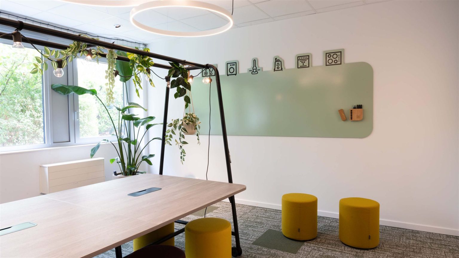
Looking for a custom whiteboard?
Learn how Chameleon custom whiteboards can be specified for your project.
Need immediate help and advice with your choice?