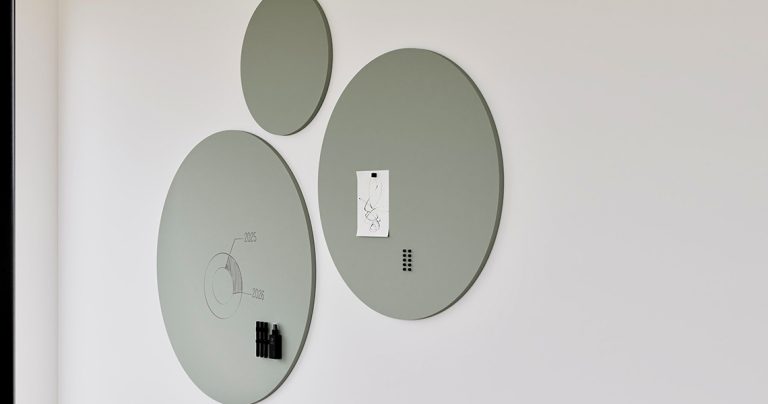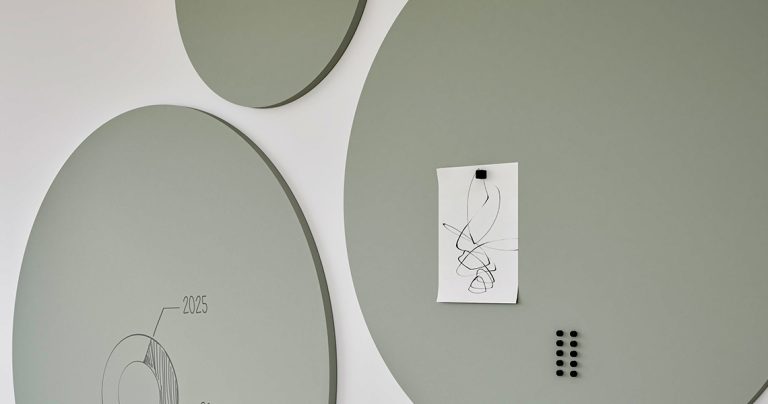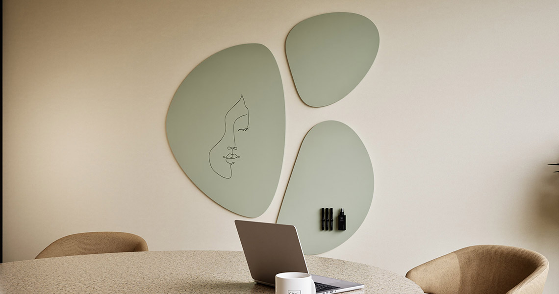
Make a design whiteboard the most visually dominant thing in a room, and it can undercut exactly the calm the rest of the interior was designed for. In rooms where visual calm matters more than presence, matching the board’s finish to the wall and mounting it flush lets it disappear until someone actually needs to write on it. Get the lighting and mounting right and the result is a wall that stays quiet, not an absence.

Array
(
    [1049] => WP_Post Object
        (
            [ID] => 1049
            [post_author] => 1
            [post_date] => 2026-06-17 10:36:57
            [post_date_gmt] => 2019-08-05 13:54:24
            [post_content] =>
            [post_title] => Products
            [post_excerpt] =>
            [post_status] => publish
            [comment_status] => closed
            [ping_status] => closed
            [post_password] =>
            [post_name] => whiteboards-5
            [to_ping] =>
            [pinged] =>
            [post_modified] => 2026-06-17 10:36:57
            [post_modified_gmt] => 2026-06-17 10:36:57
            [post_content_filtered] =>
            [post_parent] => 0
            [guid] => https://chameleonwriting.falkor.alcor.cloud/?p=1049
            [menu_order] => 1
            [post_type] => nav_menu_item
            [post_mime_type] =>
            [comment_count] => 0
            [filter] => raw
            [db_id] => 1049
            [menu_item_parent] => 0
            [object_id] => 1049
            [object] => custom
            [type] => custom
            [type_label] => Custom Link
            [title] => Products
            [url] => #
            [target] =>
            [attr_title] =>
            [description] =>
            [classes] => Array
                (
                    [0] =>
                )

            [xfn] =>
        )

    [12842] => WP_Post Object
        (
            [ID] => 12842
            [post_author] => 82
            [post_date] => 2026-06-17 10:36:57
            [post_date_gmt] => 2023-08-31 08:07:16
            [post_content] =>
            [post_title] =>
            [post_excerpt] =>
            [post_status] => publish
            [comment_status] => closed
            [ping_status] => closed
            [post_password] =>
            [post_name] => 12842
            [to_ping] =>
            [pinged] =>
            [post_modified] => 2026-06-17 10:36:57
            [post_modified_gmt] => 2026-06-17 10:36:57
            [post_content_filtered] =>
            [post_parent] => 0
            [guid] => https://chameleonwriting.falkor.alcor.cloud/?p=12842
            [menu_order] => 67
            [post_type] => nav_menu_item
            [post_mime_type] =>
            [comment_count] => 0
            [filter] => raw
            [db_id] => 12842
            [menu_item_parent] => 0
            [object_id] => 12839
            [object] => page
            [type] => post_type
            [type_label] => Page
            [url] => https://chameleonwriting.com/en/references-3/
            [title] => References
            [target] =>
            [attr_title] =>
            [description] =>
            [classes] => Array
                (
                    [0] =>
                )

            [xfn] =>
        )

    [11862] => WP_Post Object
        (
            [ID] => 11862
            [post_author] => 82
            [post_date] => 2026-06-17 10:36:57
            [post_date_gmt] => 2023-08-21 13:36:51
            [post_content] =>
            [post_title] => pCon
            [post_excerpt] =>
            [post_status] => publish
            [comment_status] => closed
            [ping_status] => closed
            [post_password] =>
            [post_name] => pcon-data
            [to_ping] =>
            [pinged] =>
            [post_modified] => 2026-06-17 10:36:57
            [post_modified_gmt] => 2026-06-17 10:36:57
            [post_content_filtered] =>
            [post_parent] => 4705
            [guid] => https://chameleonwriting.falkor.alcor.cloud/?p=11862
            [menu_order] => 68
            [post_type] => nav_menu_item
            [post_mime_type] =>
            [comment_count] => 0
            [filter] => raw
            [db_id] => 11862
            [menu_item_parent] => 0
            [object_id] => 4701
            [object] => page
            [type] => post_type
            [type_label] => Page
            [url] => https://chameleonwriting.com/en/information/chameleon-now-available-in-pcon/
            [title] => pCon
            [target] =>
            [attr_title] =>
            [description] =>
            [classes] => Array
                (
                    [0] =>
                )

            [xfn] =>
        )

    [32752] => WP_Post Object
        (
            [ID] => 32752
            [post_author] => 85
            [post_date] => 2026-06-17 10:36:57
            [post_date_gmt] => 2025-08-07 10:59:20
            [post_content] =>
            [post_title] => Order Samples
            [post_excerpt] =>
            [post_status] => publish
            [comment_status] => closed
            [ping_status] => closed
            [post_password] =>
            [post_name] => order-samples-2
            [to_ping] =>
            [pinged] =>
            [post_modified] => 2026-06-17 10:36:57
            [post_modified_gmt] => 2026-06-17 10:36:57
            [post_content_filtered] =>
            [post_parent] => 0
            [guid] => https://chameleonwriting.com/?p=32752
            [menu_order] => 69
            [post_type] => nav_menu_item
            [post_mime_type] =>
            [comment_count] => 0
            [filter] => raw
            [db_id] => 32752
            [menu_item_parent] => 0
            [object_id] => 32718
            [object] => page
            [type] => post_type
            [type_label] => Page
            [url] => https://chameleonwriting.com/en/chameleon-samples/
            [title] => Order Samples
            [target] =>
            [attr_title] =>
            [description] =>
            [classes] => Array
                (
                    [0] =>
                )

            [xfn] =>
        )

    [26482] => WP_Post Object
        (
            [ID] => 26482
            [post_author] => 85
            [post_date] => 2026-06-17 10:36:57
            [post_date_gmt] => 2025-01-17 11:08:57
            [post_content] =>
            [post_title] => Information
            [post_excerpt] =>
            [post_status] => publish
            [comment_status] => closed
            [ping_status] => closed
            [post_password] =>
            [post_name] => information-2
            [to_ping] =>
            [pinged] =>
            [post_modified] => 2026-06-17 10:36:57
            [post_modified_gmt] => 2026-06-17 10:36:57
            [post_content_filtered] =>
            [post_parent] => 0
            [guid] => https://chameleonwriting.com/?p=26482
            [menu_order] => 70
            [post_type] => nav_menu_item
            [post_mime_type] =>
            [comment_count] => 0
            [filter] => raw
            [db_id] => 26482
            [menu_item_parent] => 0
            [object_id] => 26482
            [object] => custom
            [type] => custom
            [type_label] => Custom Link
            [title] => Information
            [url] => #
            [target] =>
            [attr_title] =>
            [description] =>
            [classes] => Array
                (
                    [0] =>
                )

            [xfn] =>
        )

    [36031] => WP_Post Object
        (
            [ID] => 36031
            [post_author] => 85
            [post_date] => 2026-06-17 10:36:57
            [post_date_gmt] => 2025-11-12 11:54:33
            [post_content] =>
            [post_title] => ProTips
            [post_excerpt] =>
            [post_status] => publish
            [comment_status] => closed
            [ping_status] => closed
            [post_password] =>
            [post_name] => protips-2
            [to_ping] =>
            [pinged] =>
            [post_modified] => 2026-06-17 10:36:57
            [post_modified_gmt] => 2026-06-17 10:36:57
            [post_content_filtered] =>
            [post_parent] => 0
            [guid] => https://chameleonwriting.com/?p=36031
            [menu_order] => 77
            [post_type] => nav_menu_item
            [post_mime_type] =>
            [comment_count] => 0
            [filter] => raw
            [db_id] => 36031
            [menu_item_parent] => 0
            [object_id] => -325
            [object] => kennisbank
            [type] => post_type_archive
            [title] => ProTips
            [type_label] => Post Type Archive
            [url] => https://chameleonwriting.com/en/protips/
            [target] =>
            [attr_title] =>
            [description] =>
            [classes] => Array
                (
                    [0] =>
                )

            [xfn] =>
        )

    [19332] => WP_Post Object
        (
            [ID] => 19332
            [post_author] => 3
            [post_date] => 2026-06-17 10:36:57
            [post_date_gmt] => 2024-05-14 11:58:44
            [post_content] =>
            [post_title] => Contact
            [post_excerpt] =>
            [post_status] => publish
            [comment_status] => closed
            [ping_status] => closed
            [post_password] =>
            [post_name] => contact-4
            [to_ping] =>
            [pinged] =>
            [post_modified] => 2026-06-17 10:36:57
            [post_modified_gmt] => 2026-06-17 10:36:57
            [post_content_filtered] =>
            [post_parent] => 0
            [guid] => https://chameleonwriting.com/?p=19332
            [menu_order] => 78
            [post_type] => nav_menu_item
            [post_mime_type] =>
            [comment_count] => 0
            [filter] => raw
            [db_id] => 19332
            [menu_item_parent] => 0
            [object_id] => 19332
            [object] => custom
            [type] => custom
            [type_label] => Custom Link
            [title] => Contact
            [url] => https://chameleonwriting.com/en/contact/
            [target] =>
            [attr_title] =>
            [description] =>
            [classes] => Array
                (
                    [0] =>
                )

            [xfn] =>
        )

    [12326] => WP_Post Object
        (
            [ID] => 12326
            [post_author] => 82
            [post_date] => 2026-06-17 10:36:57
            [post_date_gmt] => 2023-08-25 07:08:58
            [post_content] =>
            [post_title] => Languages
            [post_excerpt] =>
            [post_status] => publish
            [comment_status] => closed
            [ping_status] => closed
            [post_password] =>
            [post_name] => taalschakelaar-6
            [to_ping] =>
            [pinged] =>
            [post_modified] => 2026-06-17 10:36:57
            [post_modified_gmt] => 2026-06-17 10:36:57
            [post_content_filtered] =>
            [post_parent] => 0
            [guid] => https://chameleonwriting.falkor.alcor.cloud/?p=12326
            [menu_order] => 79
            [post_type] => nav_menu_item
            [post_mime_type] =>
            [comment_count] => 0
            [filter] => raw
            [db_id] => 12326
            [menu_item_parent] => 0
            [object_id] => 12326
            [object] => custom
            [type] => custom
            [type_label] => Language switcher
            [title] => EN
            [url] => #pll_switcher
            [target] =>
            [attr_title] =>
            [description] =>
            [classes] => Array
                (
                    [0] => pll-parent-menu-item
                )

            [xfn] =>
        )

)
1
News
When a design whiteboard should disappear into the architecture, not stand out
Rooms where visual calm matters more than presence
Reception areas, executive offices and quieter breakout spaces tend to benefit from a board that recedes rather than announces itself. In these settings, a writing surface is there for occasional use, not as a constant visual anchor for the room. A board that recedes also tends to age better visually in these settings, since it does not compete with changes to furniture or artwork made in the room over time. This is especially relevant in spaces used for client meetings, where an obviously equipment-like board can slightly undercut the impression the rest of the room is designed to create.
Matching the board's finish to the wall, not the other way round
A disappearing board usually starts with the wall finish, not the board. Colour and texture are chosen to match the surrounding surface as closely as possible, so the board reads as a continuation of the wall rather than an object placed in front of it. This approach works best when the wall finish itself is relatively simple. A highly textured or patterned wall makes an exact colour match harder to achieve convincingly. Where an exact match is not achievable, a closely related tone paired with consistent lighting usually reads as intentional, whereas a mismatched but similar colour tends to look like an oversight.
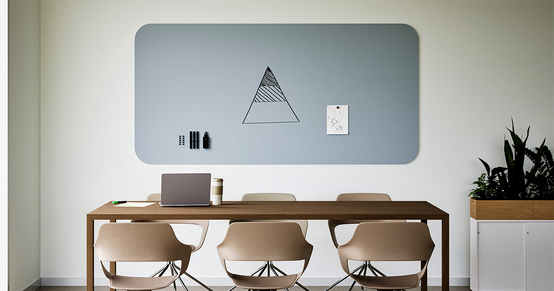
A matte SatinTones surface, available in 15 tints, tends to suit this approach better than a high-gloss white finish, since the lack of reflection means the board reads as a flat section of wall rather than a panel that catches light differently from its surroundings.
Choosing a mounting method that keeps the surface flush
A flush mount, without a raised frame or visible fixings, does most of the work in making a board disappear. Any shadow line or gap between the board and the wall tends to draw the eye in exactly the way a disappearing board is meant to avoid. Flush mounting typically requires more precise wall preparation than a standard installation, which is worth factoring into the project timeline rather than treating as a last-minute detail. It is worth confirming the wall’s construction early in the process, since a flush installation is considerably more straightforward on solid masonry than on a stud wall with limited backing.
Chameleon’s TÜV-certified magnetic mounting system is built for exactly this kind of flush, fixing-free installation, which is part of why it is the system used across the whole range rather than a separate option reserved for premium or design-focused boards.
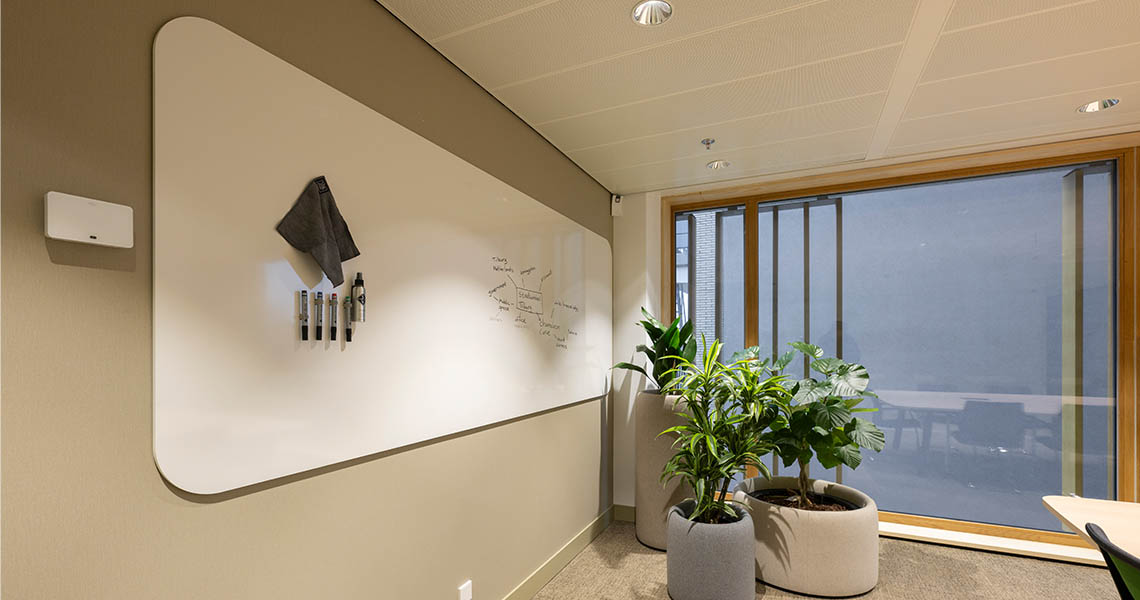
Lighting a disappearing board without making it look absent
Lighting designed to minimise glare on a writing surface can, if applied too evenly, make the board look flat and slightly out of place. A small amount of directional lighting usually keeps the surface legible without undoing the effect of an otherwise flush, colour-matched installation. Testing the lighting once the board is installed, rather than relying on the original lighting plan alone, tends to catch any glare or flatness before it becomes a permanent fixture. A lighting designer involved at the same stage as the board specification can usually resolve this with a small adjustment, rather than it becoming a fix applied after the room is already finished.
When standing out is still the right choice
Not every room benefits from a board that disappears. Workshop spaces, studios and rooms used for active cross-functional alignment often work better with a board that is clearly visible and easy to locate at a glance, since the priority there is usability over restraint. In these spaces, a visible frame or a contrasting colour can actually help a board get used more, simply because people notice it is there and available. This is also usually the better choice in spaces shared by several different teams, where a board that blends in too well can simply be overlooked by people unfamiliar with the room.
The decision behind either approach
Whether a board should stand out or disappear comes down to how the room is actually used, not a fixed design preference. A board built for long-term daily usability in a busy studio serves a different purpose to one specified for a reception area, and the two are rarely interchangeable once installed. Getting this decision right early tends to matter more than any individual detail of the installation, since a board specified for the wrong kind of room rarely performs well regardless of how carefully it is finished. Treating this as a room-level decision, rather than a fixed policy applied across the whole office, tends to produce results that suit each space rather than compromising on all of them equally.
Invisible until needed
The goal is not to hide collaboration. It is to allow the room to support focused work, hospitality or client interaction without constantly signalling “meeting space”. The most successful integrated whiteboard walls remain visually quiet until the moment a team needs them, then become active collaboration surfaces without changing the character of the room.
Looking for a design whiteboard for your office?
See how design whiteboard can be finished to either stand out or disappear, depending on the room.
Need immediate help and advice with your choice?